
The challenge
Built Strength sells premium gym equipment, the kind of purchase people research for weeks before buying. A standard theme wasn't going to explain the engineering behind the machines, show why they're better than cheaper alternatives, or help someone picture the equipment in their own space.
The brand needed a storefront that looked as serious as the product, explained it well, and kept building trust all the way through checkout, where expensive orders are most likely to be abandoned.
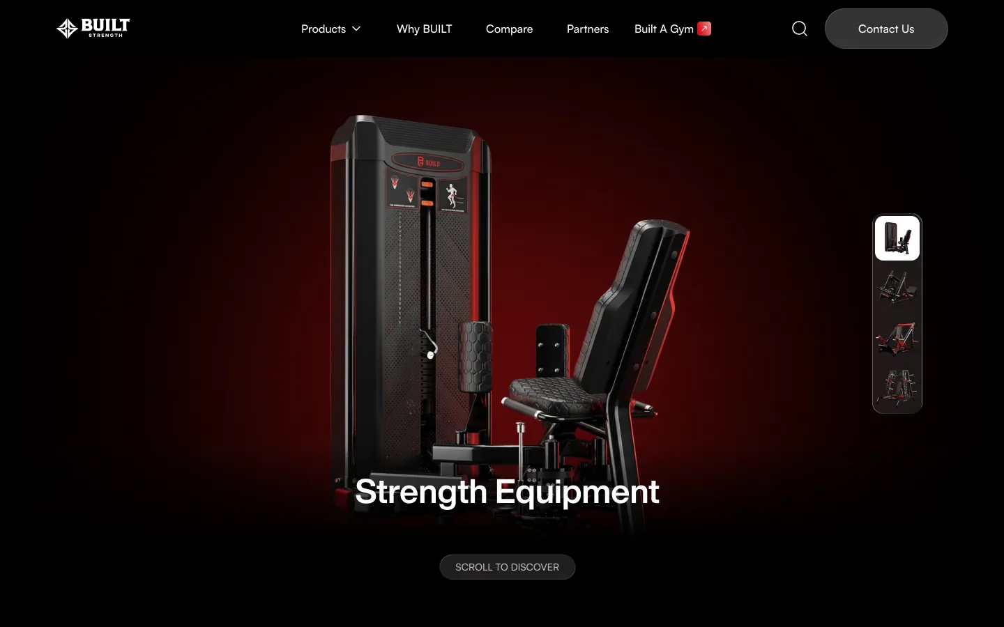
From Figma to Shopify
The design arrived as a finished Figma file: 15 page templates, each drawn twice, at 1440px for desktop and 375px for mobile, plus the navigation, search and footer states. My job was to turn every frame into a working Shopify Plus theme without losing the detail in the design.
I built each block of the design as its own Liquid section, so a page is assembled from sections in the theme editor instead of being hard-coded. Where the mobile frame differs from the desktop one, the section follows the mobile design instead of just shrinking.
What I built
A bold, consistent design language
The design alternates near-black pages, where a red glow sits behind each machine, with clean white sections for product grids and detail. I built the custom sections to that system, so new pages stay consistent as the site grows. Hero banners and sliders support separate desktop and mobile images, so the visuals look right on any screen.
Scroll-driven storytelling
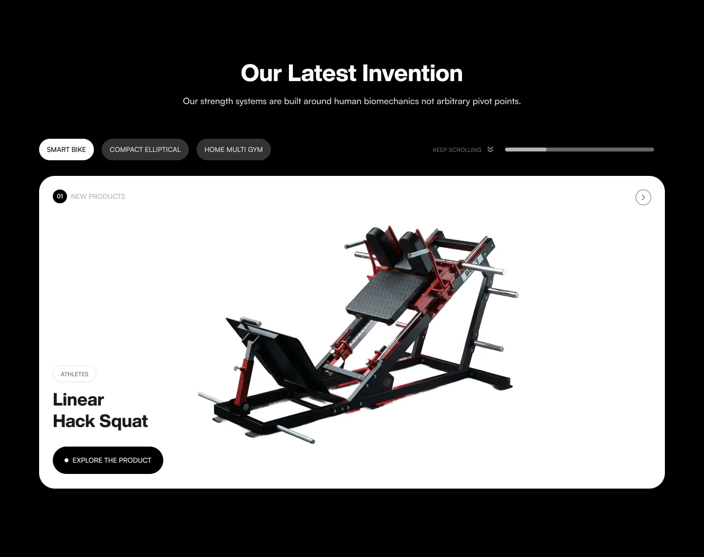
"Our Latest Invention" on the homepage walks through the newest machines one at a time. Tabs switch between products, and a "keep scrolling" progress bar shows how far through the story the visitor is.
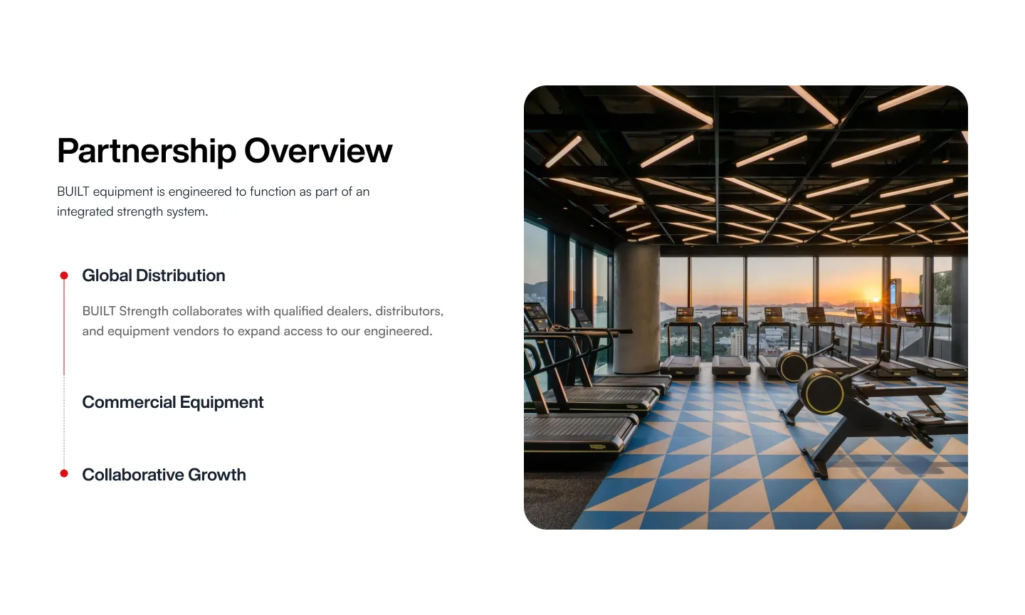
The Partnership Overview uses a sticky image beside a list of steps that switch as the visitor scrolls, built with IntersectionObserver. "Engineering Behind Every Machine" on the Why BUILT page uses the same approach, so shoppers are walked through the product step by step instead of being hit with a wall of specs.
A "BUILT vs Standard" comparison
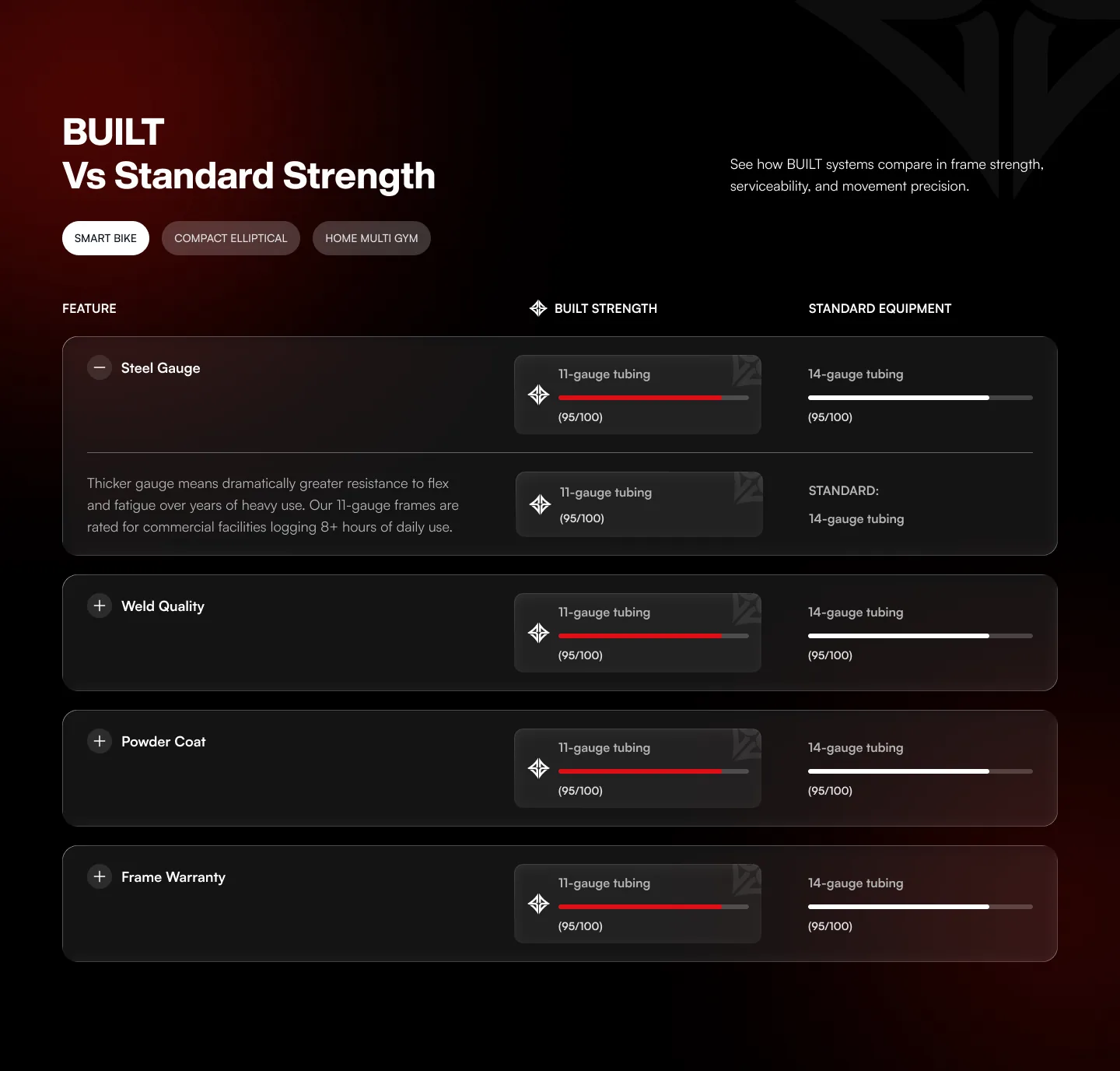
This section puts Built Strength equipment side by side with standard alternatives. Each row is one feature, such as steel gauge, weld quality, powder coat and frame warranty, with a score bar for each side and an explanation that expands when the row is opened. Tabs switch between machines.
The same section appears on the homepage, on product pages, on Why BUILT and on the Compare page, where it is used twice: against traditional plate-loaded machines and against legacy selectorized machines. It uses tabs on desktop and switches to an accordion on mobile, so the comparison stays easy to read on smaller screens.
Product pages that explain the machine
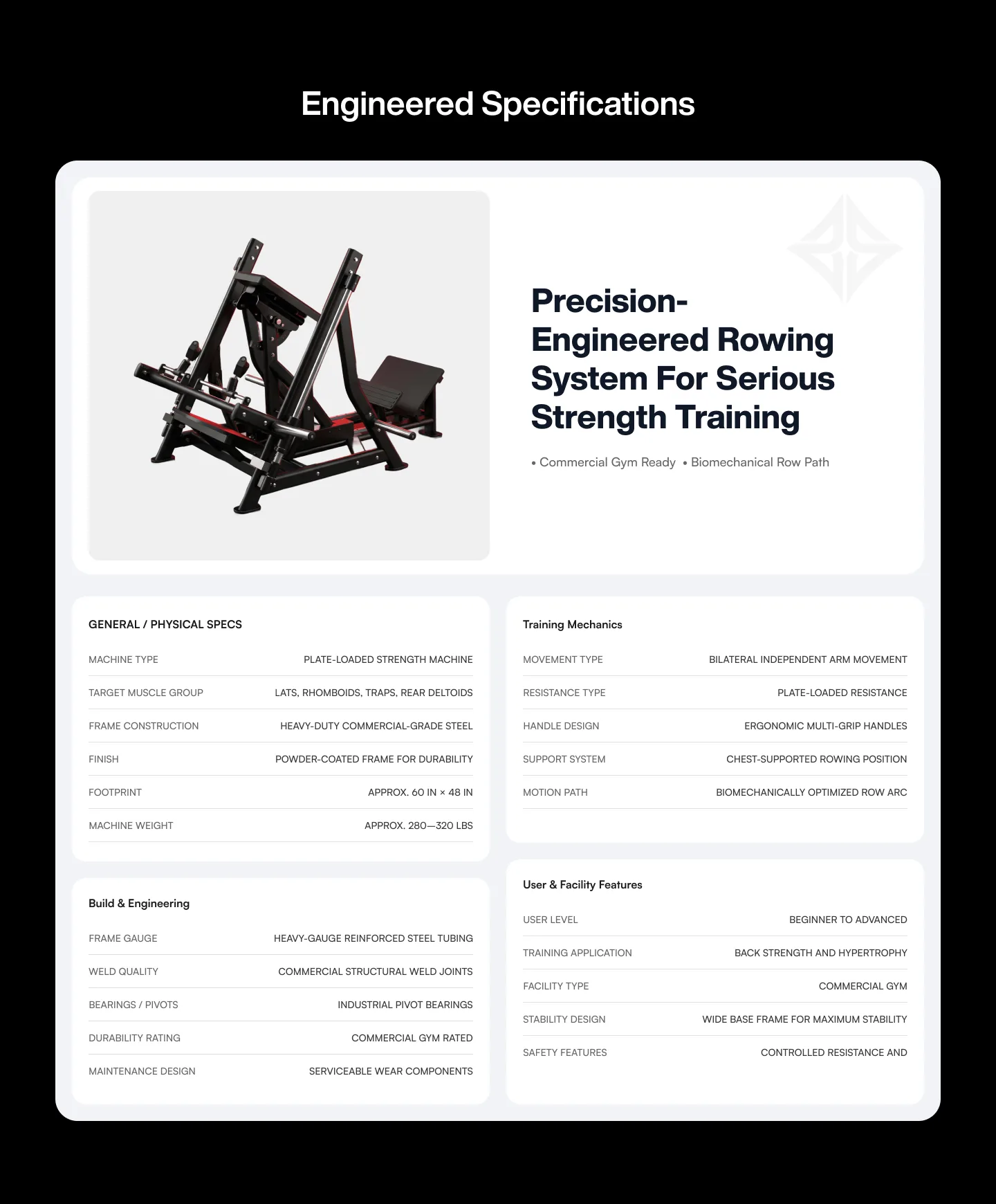
A product page here has to do the job of a salesperson. Beyond the gallery, each page carries a "Specifications & Support" slider covering the description, the muscles targeted and the warranty, a strip of key design features, and an "Engineered Specifications" block that groups the numbers into four readable tables: general and physical specs, training mechanics, build and engineering, and user and facility features.
Catalogue and search
The All Products page filters by gym type and product type and paginates long ranges. Search opens from the navigation with its own empty, typing and results states, each designed for desktop and mobile.
A 3D gym planner
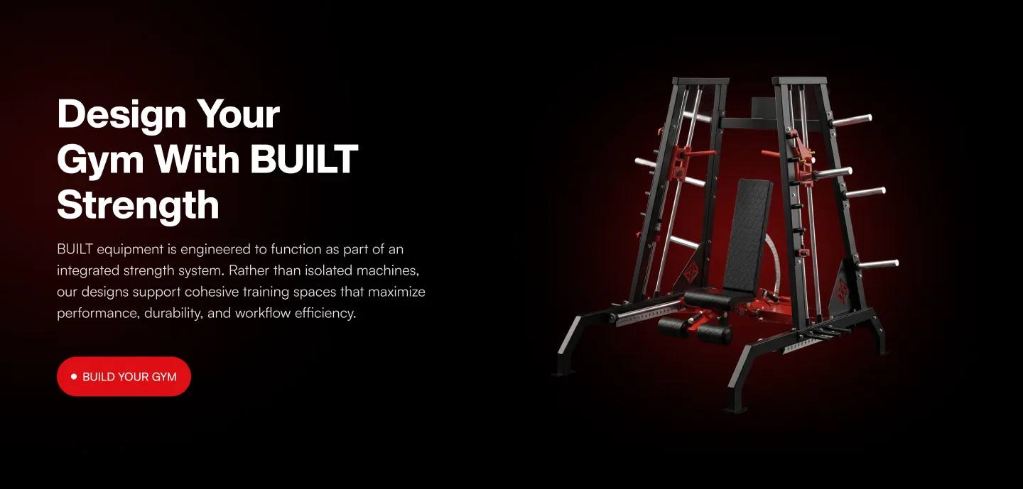
The Design With BUILT page explains how planning a gym works in four steps, from planning the space to building it. I embedded Planner 5D so shoppers can design their home gym layout in 3D and see how the equipment fits their space before committing to a big purchase. "Build A Gym" sits in the main navigation, so the planner is one click away from every page.
Reviews inside checkout
Using Shopify CLI, React and TypeScript, I built a Checkout UI Extension that shows customer review cards in the order summary. Shoppers see real feedback at the exact moment they're deciding whether to pay, which is where reassurance matters most.
Trust and lead capture across the site
The Partners page presents the dealer and vendor programme and ends in an application form. I added a testimonials carousel using the store's existing Reputon reviews, a blog slider, a Schedule Meeting page for buyers who want to talk before ordering, and an announcement bar. I also built the contact section, confirmation messages, 404 page, policy pages and a login redirect that returns customers to where they left off.
The result
Built Strength now has a storefront that matches the quality of its equipment, built to the Figma design on desktop and mobile. Shoppers can learn how the machines are engineered, compare them against standard options, plan their gym in 3D and book a call, all before reaching checkout. Once there, real customer reviews help carry high-value orders over the line.