
The challenge
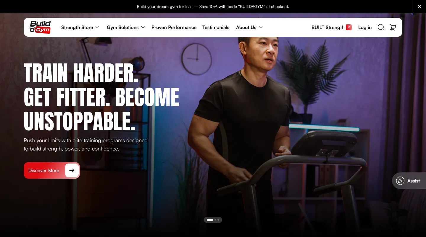
CTX Home Gyms is a family-run business in Texas that sells new, remanufactured and BUILT Strength commercial gym equipment, with a free room planner, warranty, nationwide shipping and installation. Their customers range from people kitting out a garage to owners fitting out a full commercial facility, and many of the machines cost several thousand dollars.
The team had a complete set of Figma designs for a new storefront. My job was to turn those designs into a Shopify theme that matched the Figma files closely, worked well on every screen size, and could be edited by the in-house team without calling a developer each time they wanted to change a banner or swap a product.
The designs covered the whole store: the homepage, shop-by-goal and product pages, the cart, gym solutions, delivery and shipping, testimonials, the About pages, the blog and the policy pages, each drawn for desktop and for mobile.
Store: ctxhomegyms.com ↗
How I approached it
Pixel-accurate sections from Figma
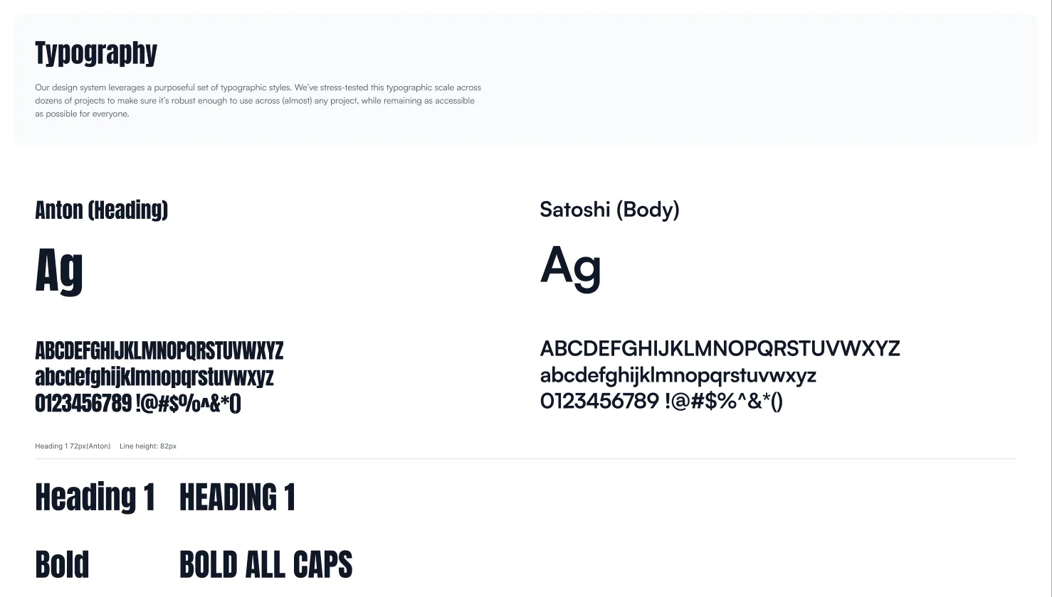
I broke the Figma files into reusable Shopify sections and followed the spacing, typography and colour rules from the design system. The style guide sets Anton for headings and Satoshi for body text, on a palette of red, near-black and warm off-white. Each section has theme editor settings for text, images, links and layout, so the team can reuse the same section on different pages without touching code.
Separate desktop and mobile designs
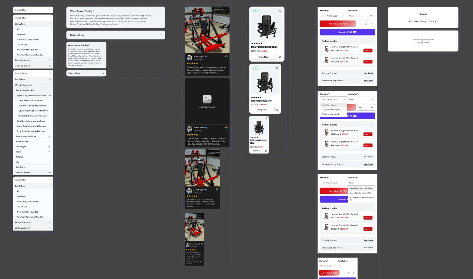
Where the Figma files had different mobile layouts, I built them as real mobile layouts rather than squeezing the desktop version. Hero banners and sliders accept separate desktop and mobile images, and the "BUILT vs Standard" comparison switches from tabs on desktop to an accordion on mobile.
Interactive sections without heavy apps
Some designs called for scroll-based interactions, like a sticky image that changes as visitors scroll through a list of features. I built these with IntersectionObserver in plain JavaScript, so they run smoothly and don't slow the page down.
What I built
Homepage and shopping sections
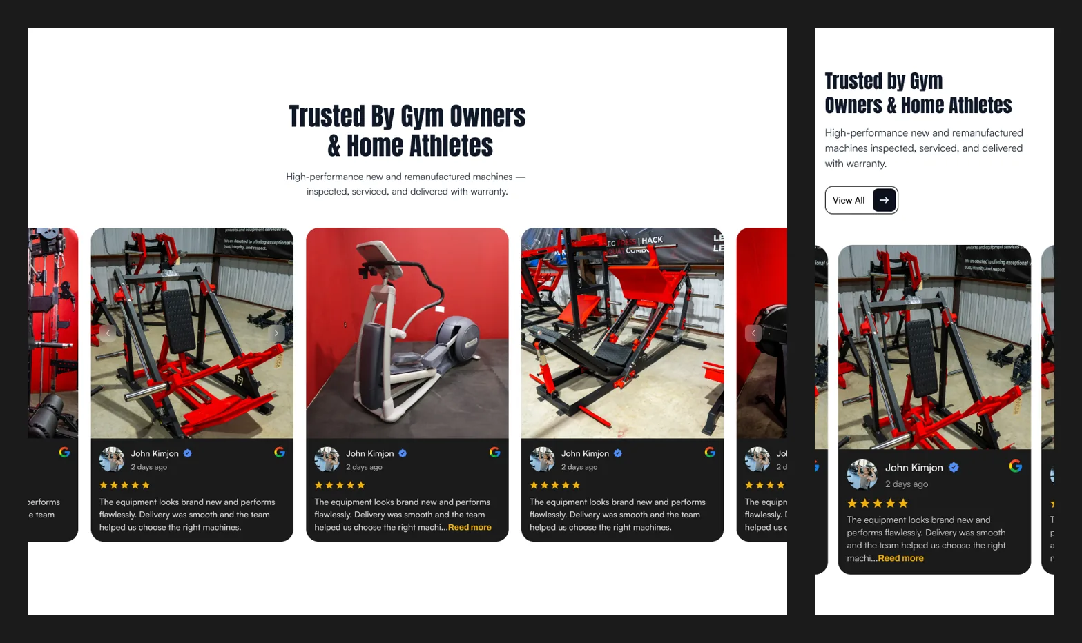
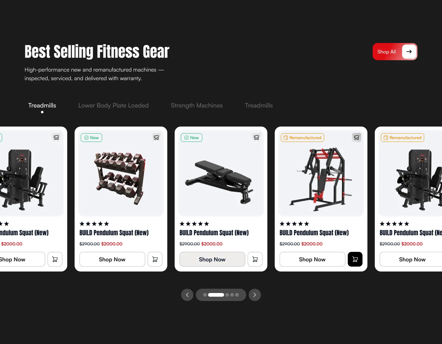
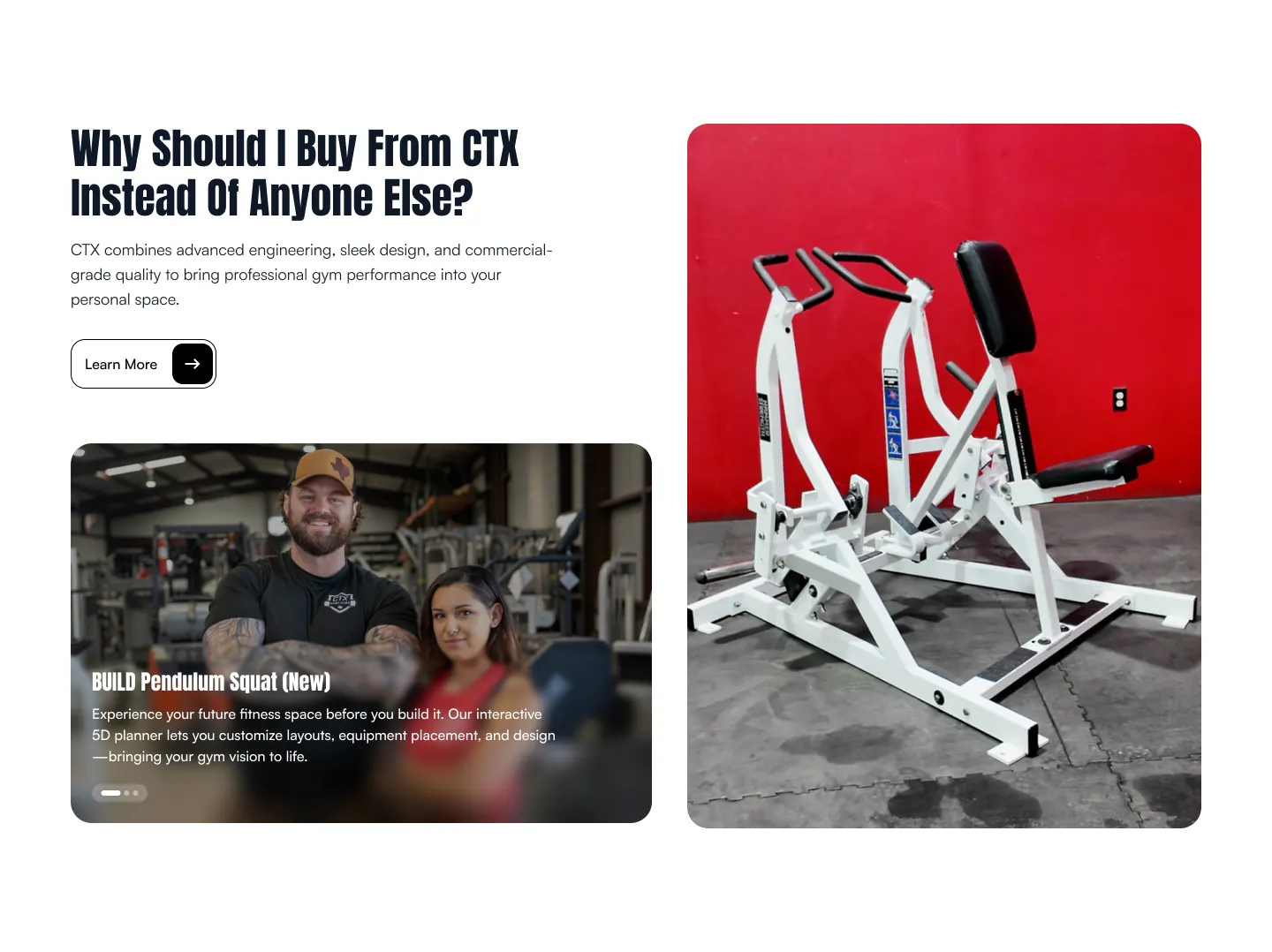
A hero slider, product carousel, "Why buy from us" section, testimonials carousel using the store's existing reviews, blog slider and announcement bar.
Brand and story pages
Engineering and "Latest Invention" showcase sections, a Partnership Overview with scroll-driven tabs, and the BUILT vs Standard comparison.
Lead generation
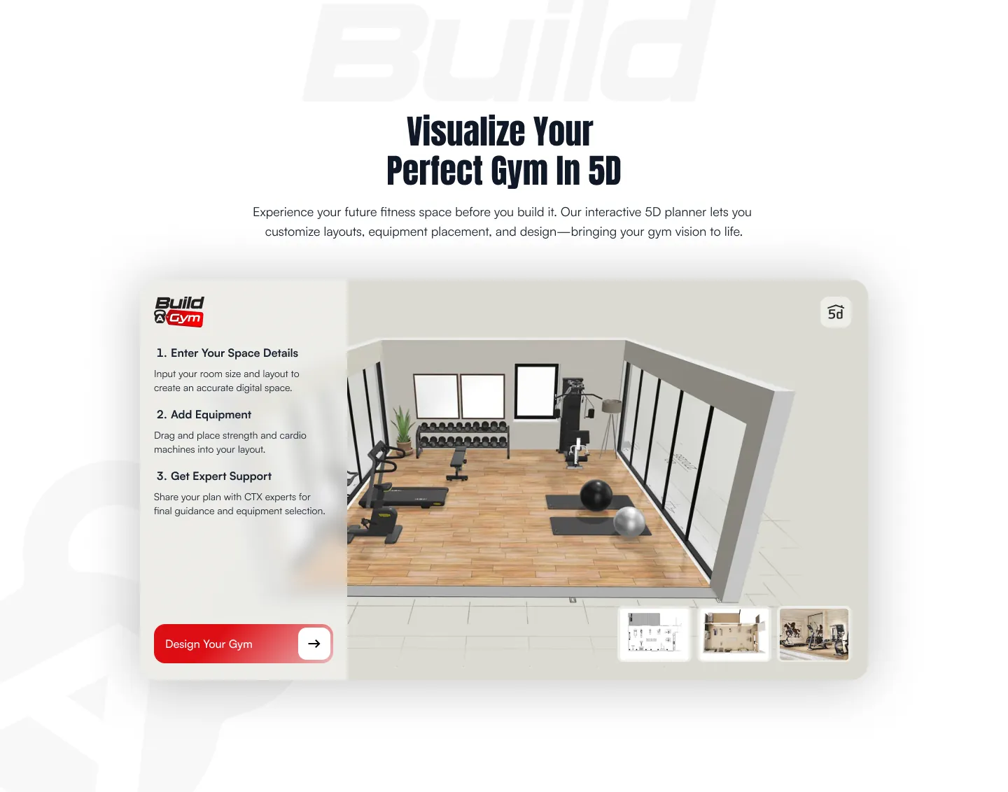
A Schedule Meeting page and contact section for buyers who want expert advice before spending thousands on equipment, plus a Planner 5D embed so shoppers can lay out their gym in 3D.
The pages people forget
A custom 404 page, privacy policy section, collection page fixes, and a login button that sends customers back to the page they were on after signing in.
Checkout
A Checkout UI Extension that shows customer reviews in the order summary, built with Shopify CLI, React and TypeScript.
The result
CTX Home Gyms got a storefront that matches its Figma designs and gives a big-ticket equipment business the trust signals, comparison tools and contact options its buyers need. Because everything was built as configurable sections, the team can keep building new pages from the same blocks as the business grows.