
The challenge
Solano Jewelers has been one of the East Bay's trusted fine jewelers since 1977. Most of their business happens in person: engagement rings, custom pieces, repairs and redesigning family heirlooms, often for clients who come back for every milestone.
Their old website didn't reflect that. It leaned heavily on the "SJ" monogram, the hero didn't say clearly who they were, the navigation and footer were cluttered, the mobile experience was weak, and key legal pages were missing. They also wanted to start selling online without losing the personal, high-end feel of the store.
The project had three parts. A luxury redesign of the brand site with stronger heritage storytelling. An online shop for their own collection of rings, earrings, necklaces, bracelets and wedding bands. And a private collection of high-value pieces that only selected clients could see.
Live site: solanojewelers.com ↗
How I approached it
Prototype first, then Shopify
For each section, I built an HTML prototype, refined it across screen sizes, then converted it into Liquid with a full settings schema. This kept the build close to the Figma designs and made each part easy to test before it went into the theme.
A quiet, luxury visual language
Cormorant Garamond headings, Jost body text and warm off-white tones run through every page, so the brand site and the shop feel like one experience.
Built for the team to edit
Every section has colour pickers, image pickers, rich text, spacing sliders, toggles and per-block settings, so the team can update content without a developer.
Safe inside any theme
All styles are scoped to their own section, so the custom work doesn't clash with the base theme and stays stable through theme updates.
What I built
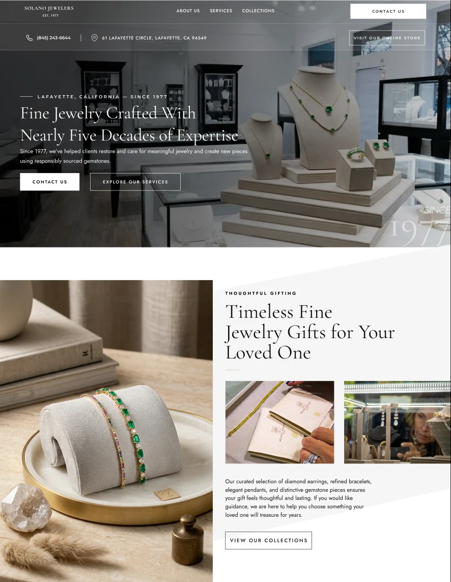
A brand site that puts the family first
The redesign moves the focus away from the "SJ" monogram and onto the Solano Jewelers name, the 1977 heritage and the people behind the store. The homepage follows a clear path: a hero with a direct positioning statement, an immediate highlight of their pieces and services, a founder and heritage story, a Family Treasures section for heirloom work, testimonials, and a clear entry point into the online shop.
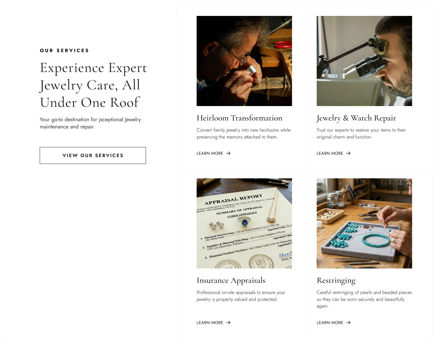
Supporting sections include Jewelry Services, Process Steps, a contact form, a Visit Us section with Google Maps and a client gallery with drag and momentum scrolling.
Cleaner navigation and footer
A transparent header turns solid on scroll, with clear hover and active states and a simple slide-out menu on mobile. The footer was rebuilt into a tidy four-column layout with certification badges and proper links to the legal pages.
Legal pages
Privacy Policy, Terms and Conditions, and Shipping, Refund and Return policies, all styled to match the rest of the site.
A separate shop experience
The shop has its own home and navigation. The brand pages stay clean with no cart or search, while the shop adds both, so reading the story and buying a piece each feel right for their purpose.
Shop: solanojewelers.com/pages/ecom-home ↗
Collections landing page
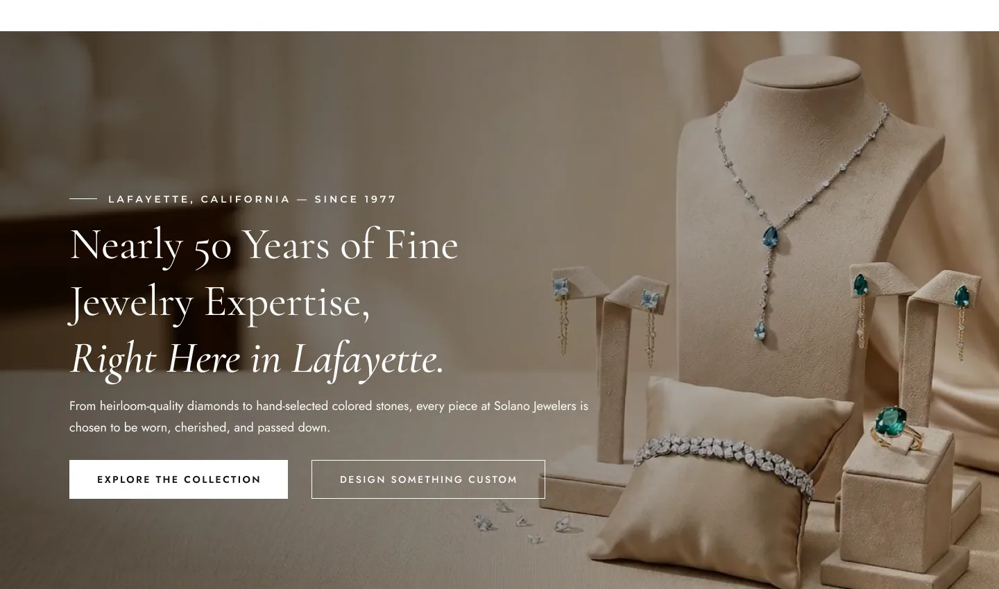
A page introducing each category, including a dedicated Wedding Bands and Eternity Rings section, with Google reviews and a "Styled by Our Clients" gallery to build trust before shoppers start browsing.
Category collection pages
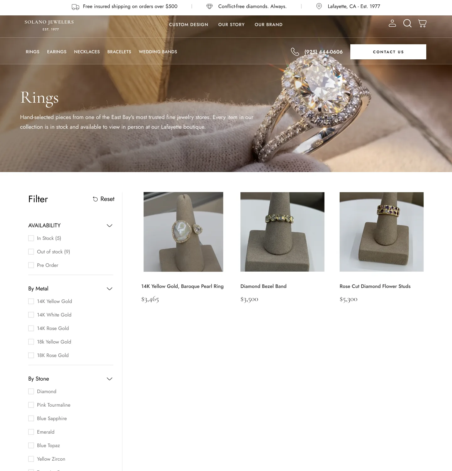
Rings, earrings, necklaces and bracelets each have their own page with filters built around how people actually shop for jewelry: availability (including pre-order), metal, gemstone, ring size, carat weight and price.
Two kinds of product page
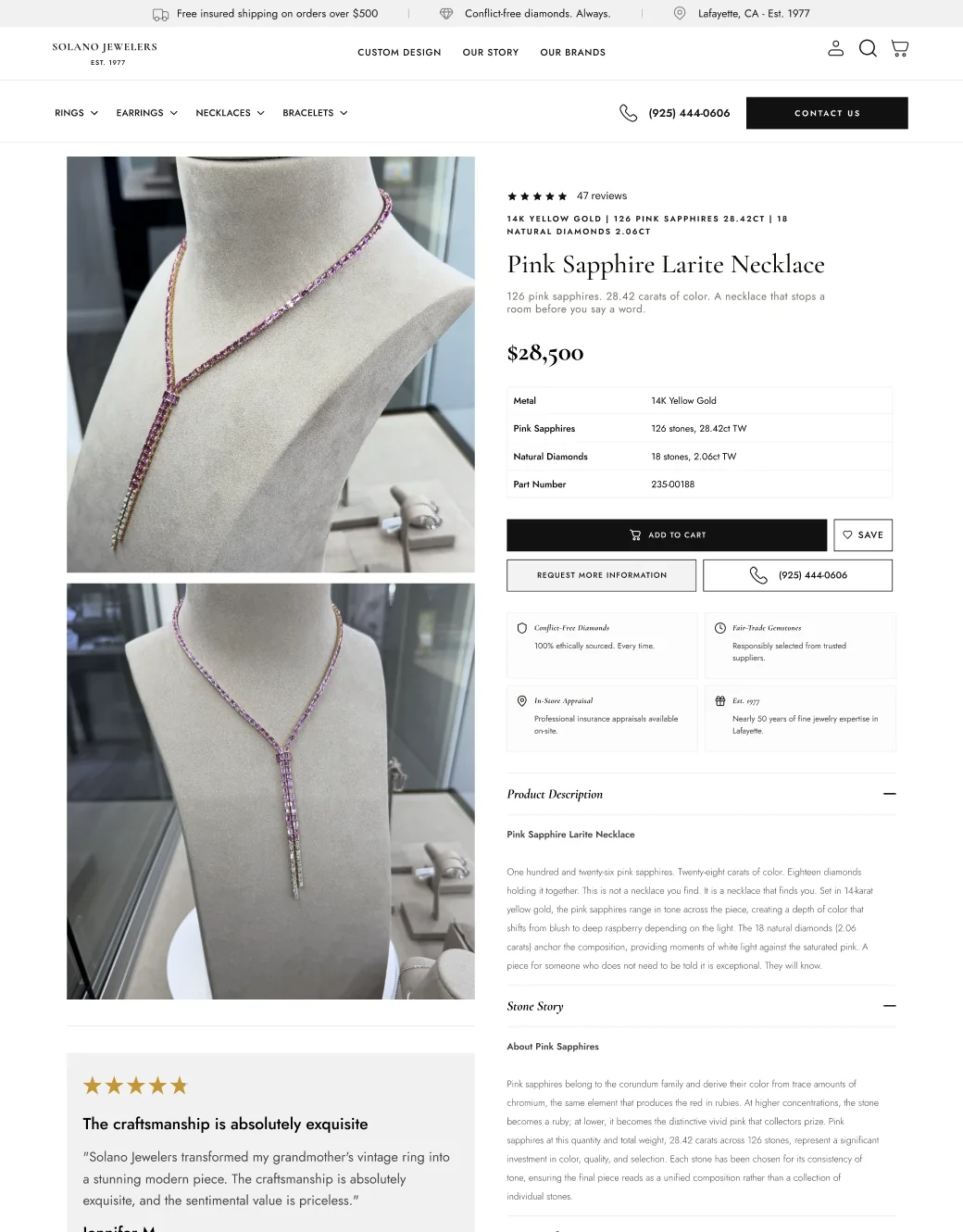
Standard product pages focus on the essentials: metal, stone, style, ring size and add to cart. Luxury product pages go much deeper for high-value pieces, with full specifications such as stone counts and total carat weight, a "Stone Story", care guidance, insured shipping details, and a "Request More Information" option with a direct phone line for buyers who want to talk before committing. Both include trust points like conflict-free diamonds, in-store try-on and free first resizing.
The Luxury Edit
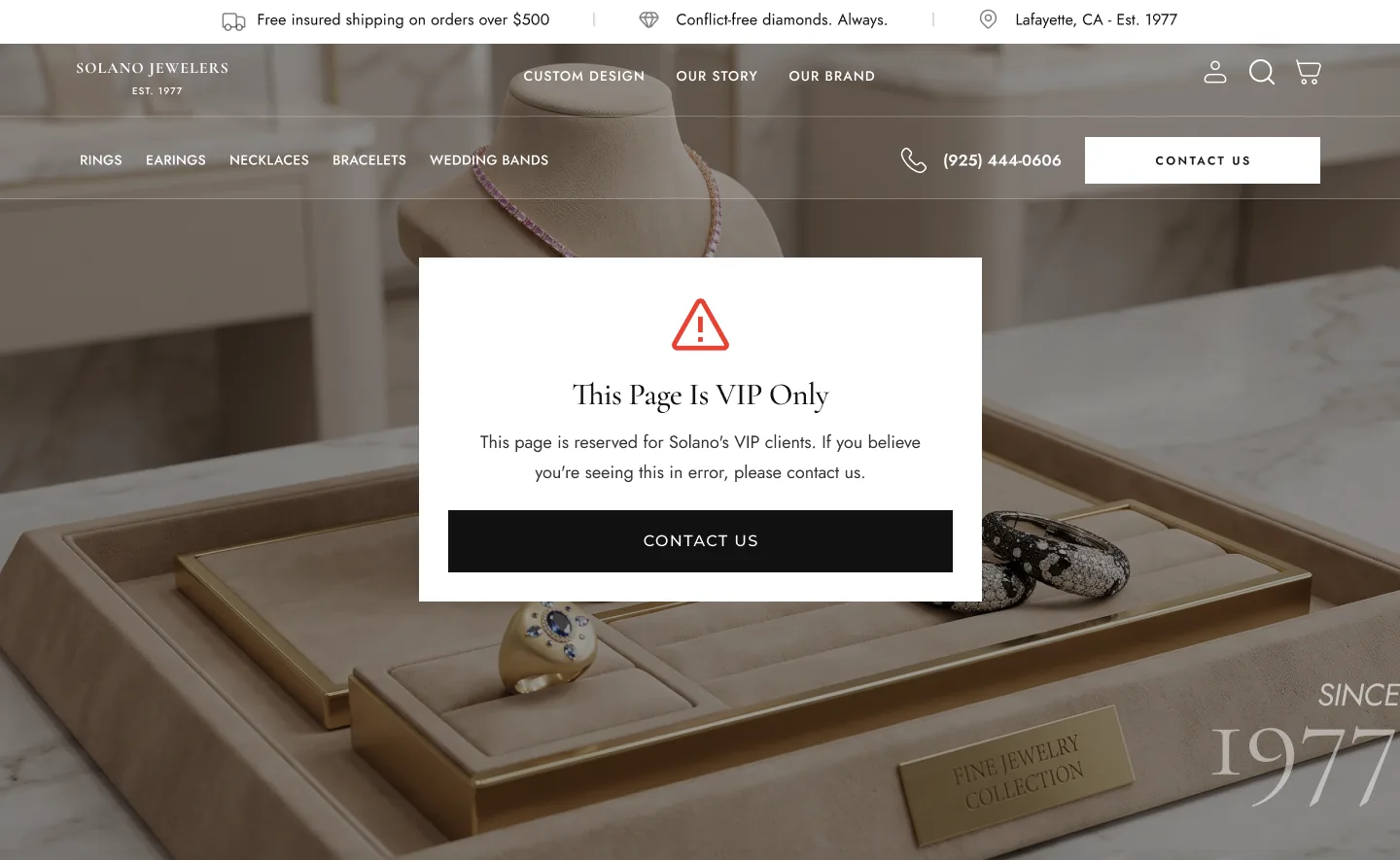
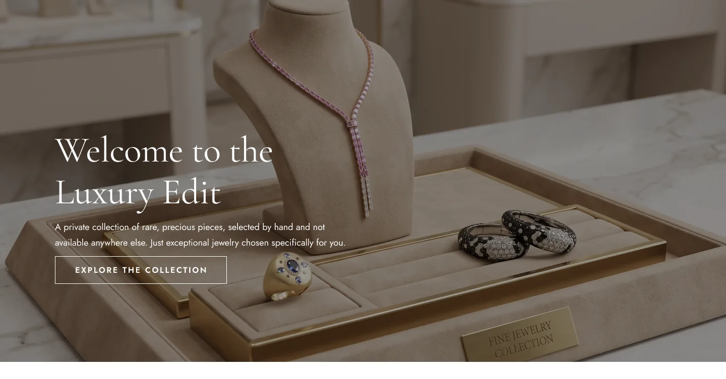
A private collection for Solano's most exclusive pieces, built from Figma as its own Shopify template. I used the Password Protect & Login Lock app to restrict access, so only invited clients with the password can view it. It works like a digital version of the private viewing Solano offers in the store.
Luxury Edit (locked unless you have been invited): solanojewelers.com/pages/ecom-luxury ↗
The result
Solano Jewelers now has a website that looks and feels like a luxury jeweler, with their heritage and family at the centre instead of a logo. Visitors can move naturally from the brand story into an online shop where they can filter and explore pieces in real detail, and the most valued clients have a private Luxury Edit of their own. The team can manage every page themselves and add new pieces as the collection grows.